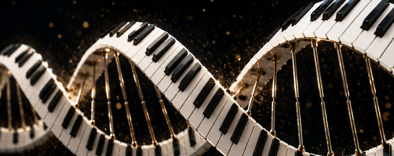
Musical DNA
A new single drops, you give it a listen, and… it sounds familiar. You hum the tune and try to place it. This is something we’ve all experienced, and it’s no secret that artists across all genres tend to reach for the same chord progressions as their structural foundation. You may have seen Ed Sheeran or Charlie Puth demonstrate this live, playing through a handful of chords and watching the audience recognize song after song built on the same skeleton. These progressions are the load-bearing walls of a track; the melody, rhythm, and instrumentation are the interior design. But how universal is this really? Can we detect patterns that cut across artists, time periods, and genres? Or does each genre operate in its own harmonic silo, like rock musicians favoring progressions that pop writers never touch? That’s what we’re going to explore across a pool of over tracks spanning more than years of recorded music.
Building the Structure
Let’s start with the framework we’ll use to analyze each track. Think of a piano keyboard. Anyone who’s taken a lesson knows where to find C, and the standard hand position that rests your right thumb there. We’ll build our analysis around that familiar ordering:
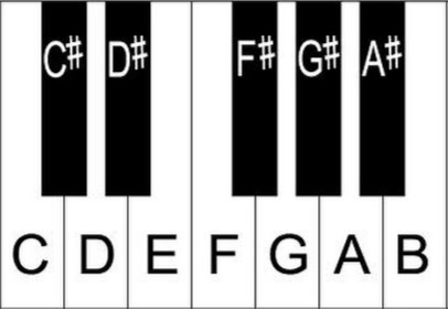
You might ask: what about flats? A C# and a D♭ are the same pitch, enharmonic equivalents. Flats exist largely for notational readability when writing out sheet music, but for our purposes, we collapse them. One note, one label.
Now let’s arrange these twelve notes in a circle, with six chord variations mapped to each root.
We can represent the chord progression of any song by drawing arrows between chords in the order they appear. The color of each arrow encodes how frequently that transition occurs in the song (its weight). The result is a directed graph: a network that captures both the harmonic vocabulary of a song and the order in which those chords are visited. This becomes our fingerprint.
A musician reading this might raise some fair objections. This graph doesn’t capture every chord variation; a C# minor diminished or a D augmented suspended fourth won’t be represented with full precision. After consulting with a few musicians (and drawing on my own brief foray into music theory), I landed on a reasonable simplification: the first quality of a chord carries most of the harmonic weight. The suspended fourths and added ninths are real, but they’re seasoning. We’re mapping the meal.
What a Song Looks Like
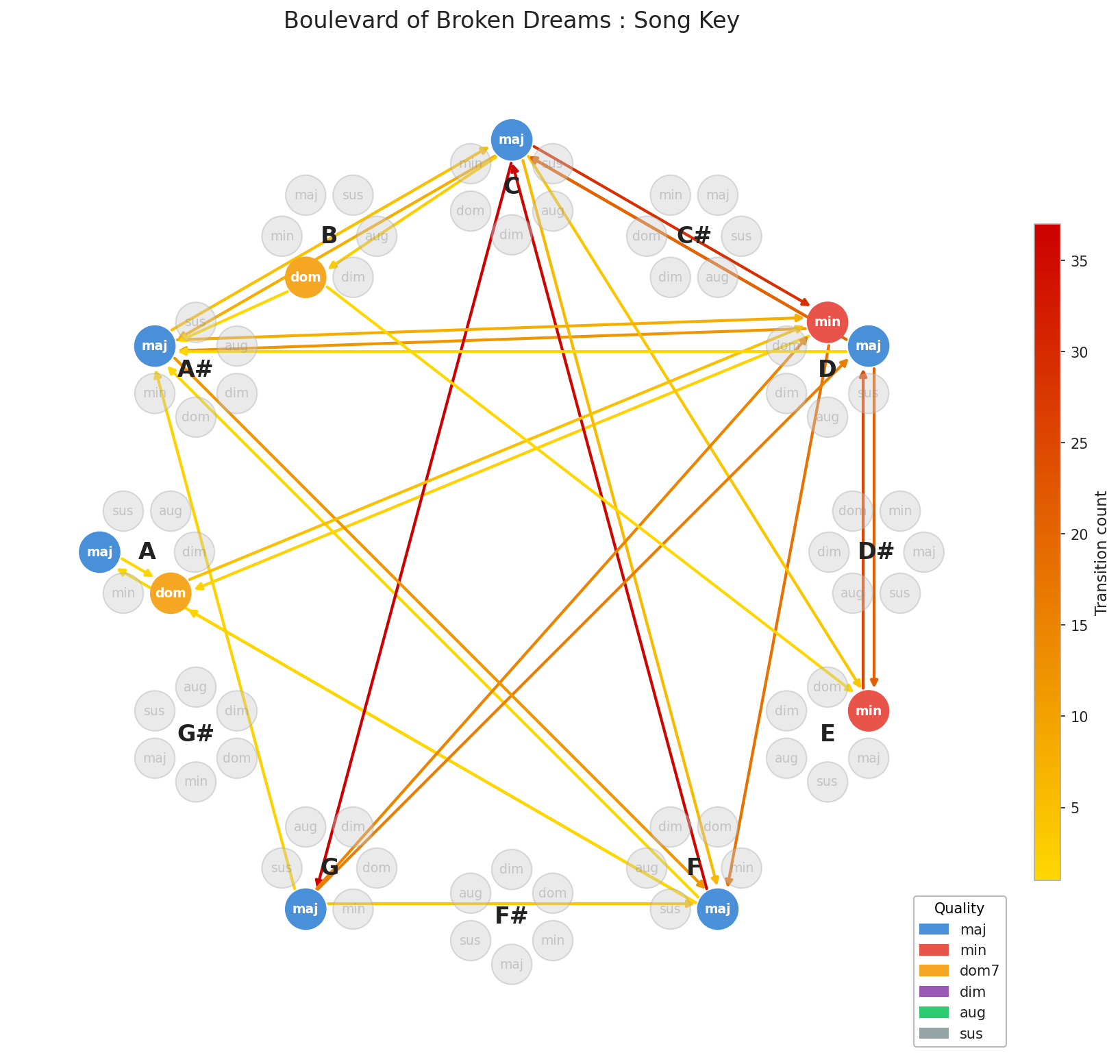
So what does a real song look like as a graph? Let’s use a good example, one that isn’t in C major so we can appreciate the rotation step coming up. Let’s look at, the classic, Boulevard of Broken Dreams by Green Day.
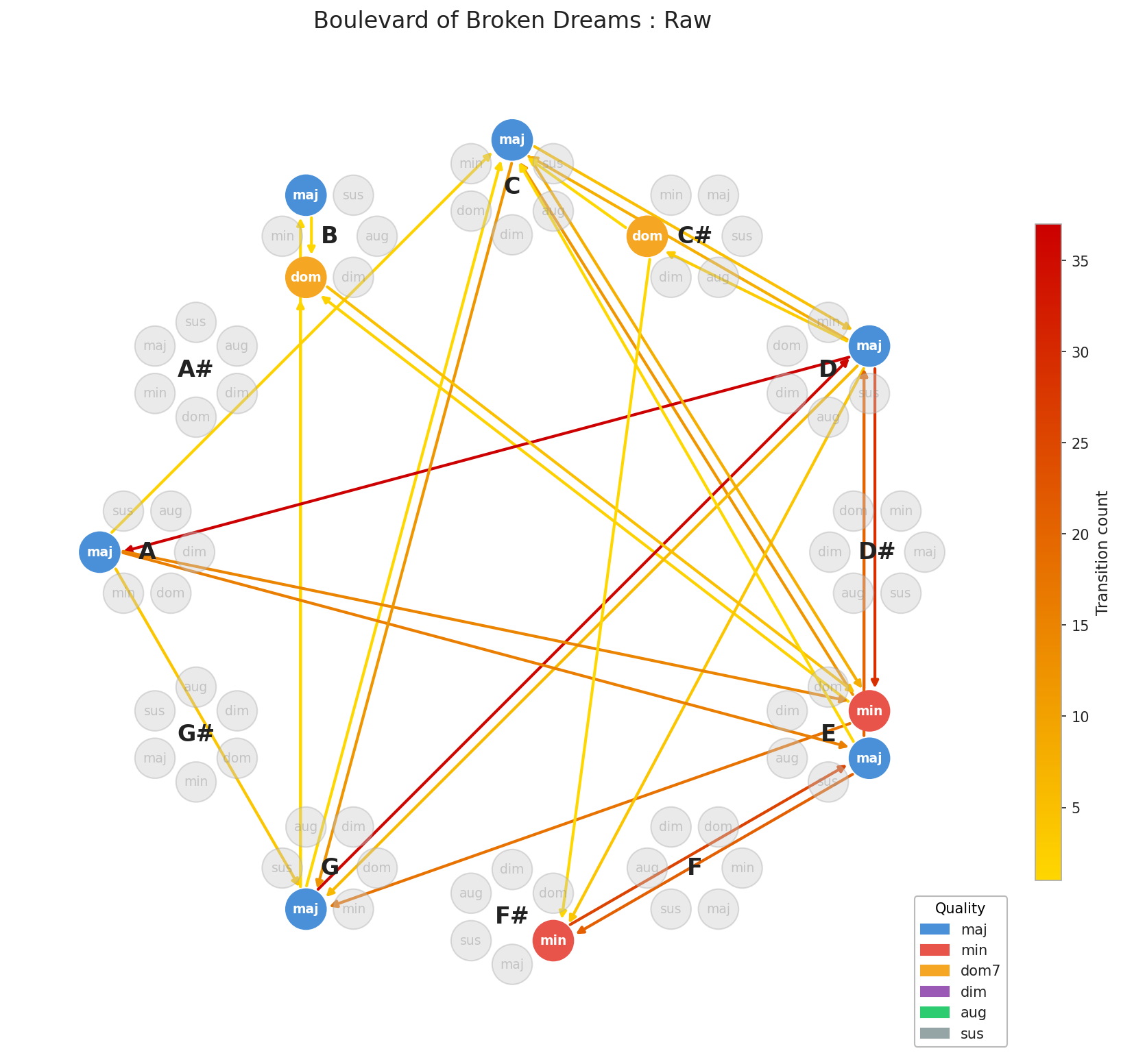
Notice the empty space and the repetition. Most songs don’t use all twelve roots; they orbit a small cluster. This is by design, staying close to a key center gives music its sense of home and tension. But here’s the problem: a song in E major and a song in G major could share the exact same progression and look completely different on this graph just because of where they start. We’d be comparing shapes that should match but don’t.
The fix is key standardization. For major keys, we rotate everything to C major. For minor keys, we land on A minor. These two keys are ideal anchors because they share the same set of frequently-used chords, making cross-song comparison meaningful. The rotation is straightforward as it’s just a shift proportional to the distance between the song’s home key and our standard:
The overall shape is preserved, it just moves. But what about key changes within a song? Those happen too, and ignoring them would smear our representation. We handle this by profiling chord usage within each section of a song independently. Since we aren’t given the key directly in the data, we infer it by counting chord occurrences per section and comparing against known key profiles. It’s essentially a fingerprint match.
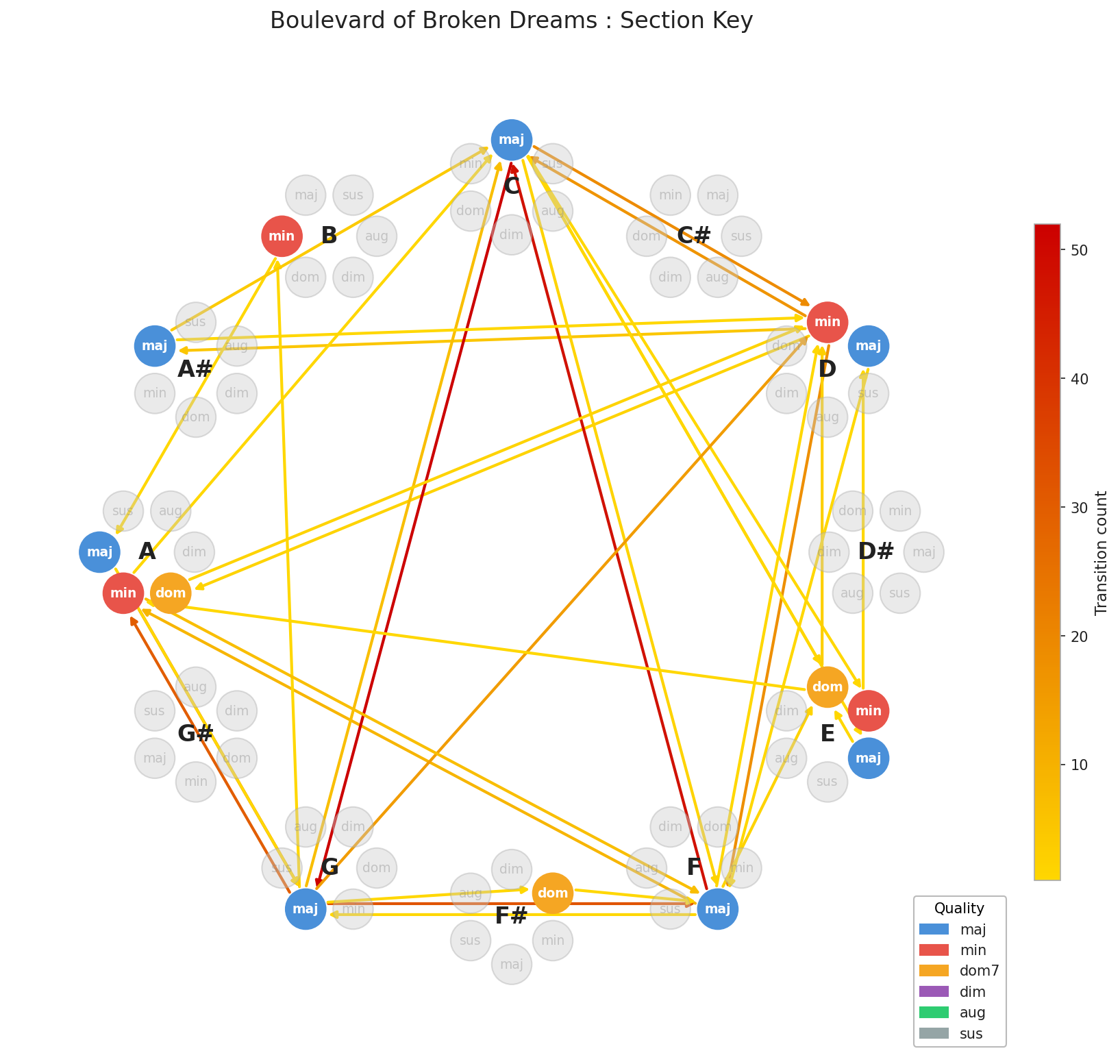
The result is a clean, comparable representation for any track in the dataset.
Patterns Across Genres
Now for the interesting part. Let’s look at how chord progressions distribute across genres in aggregate.
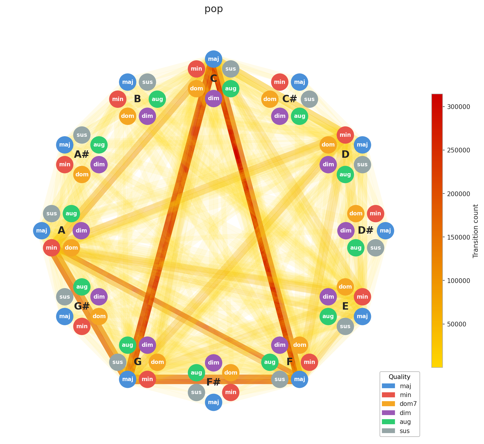
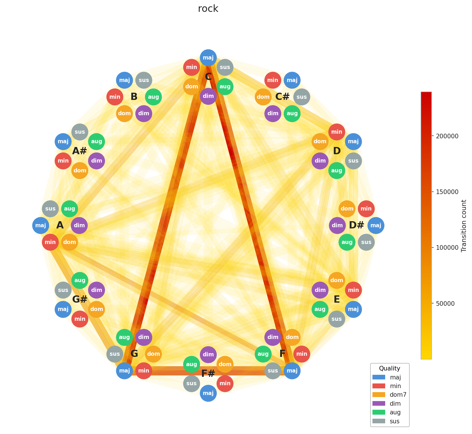
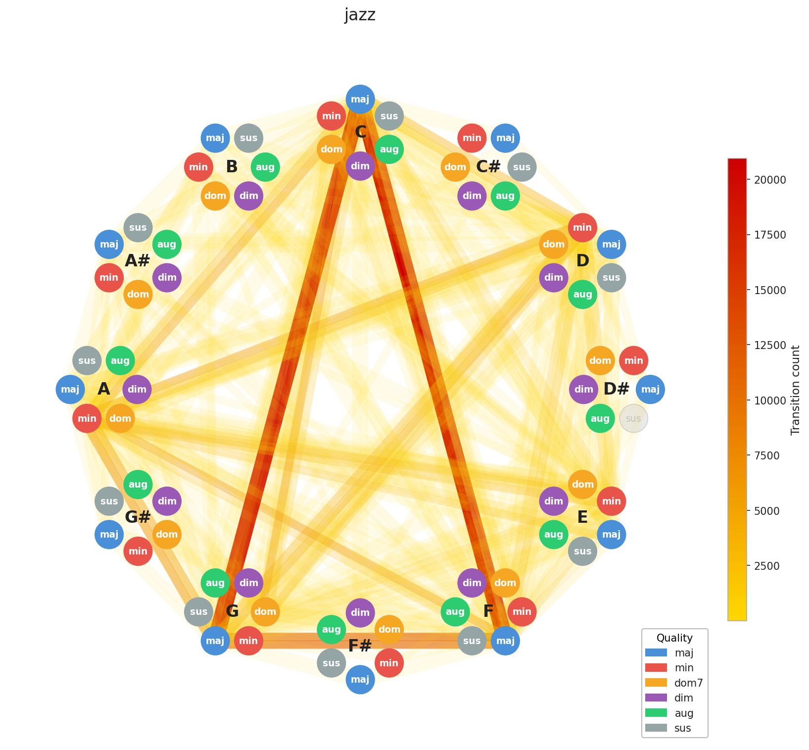
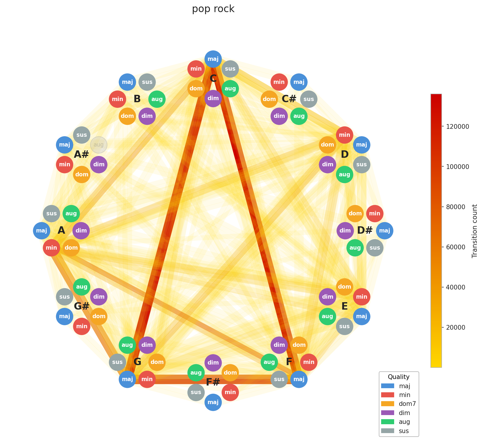
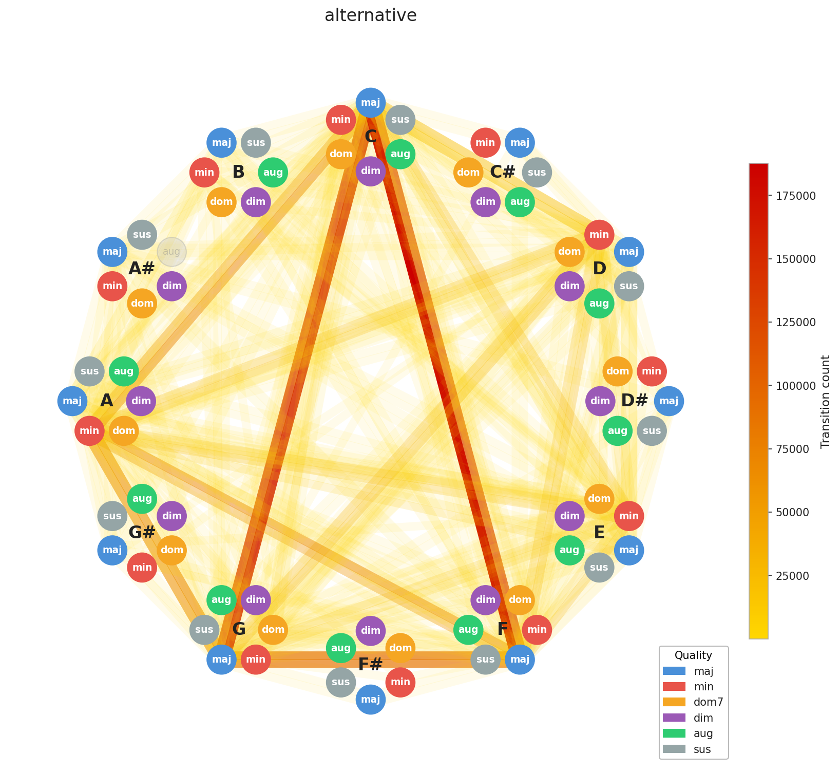
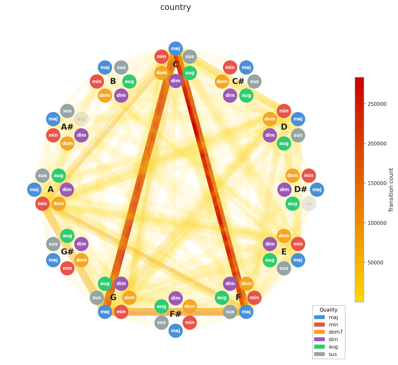
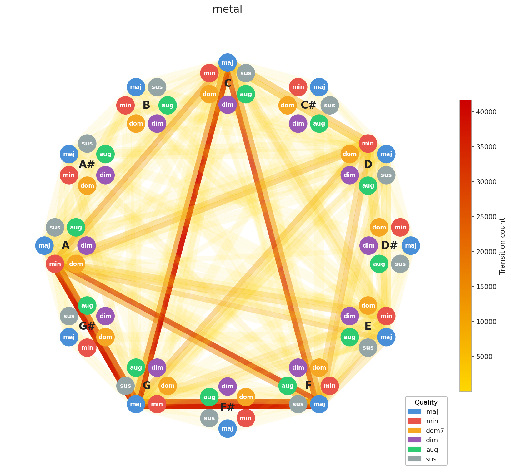
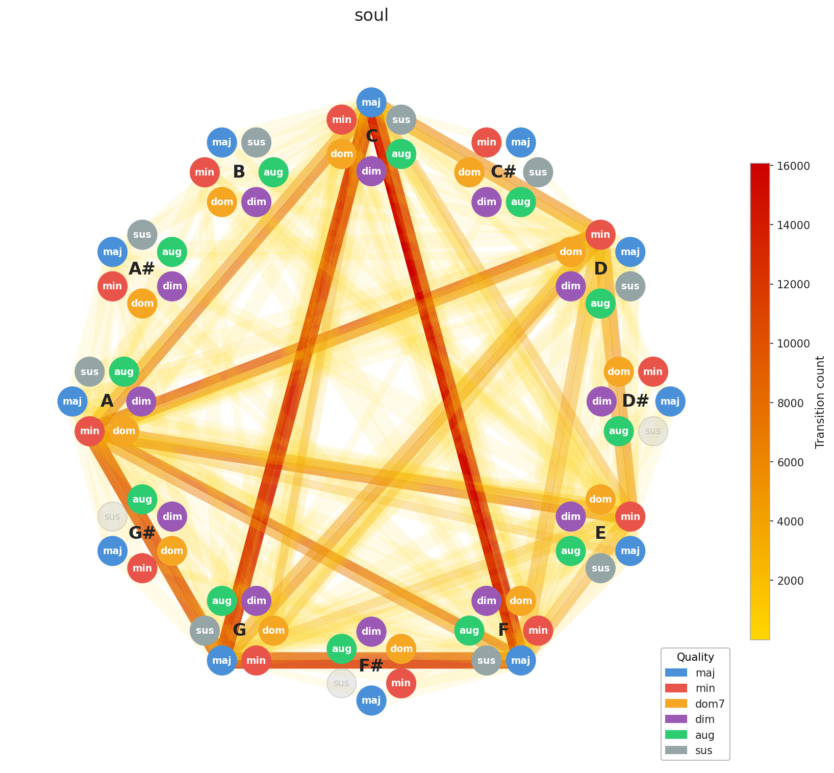
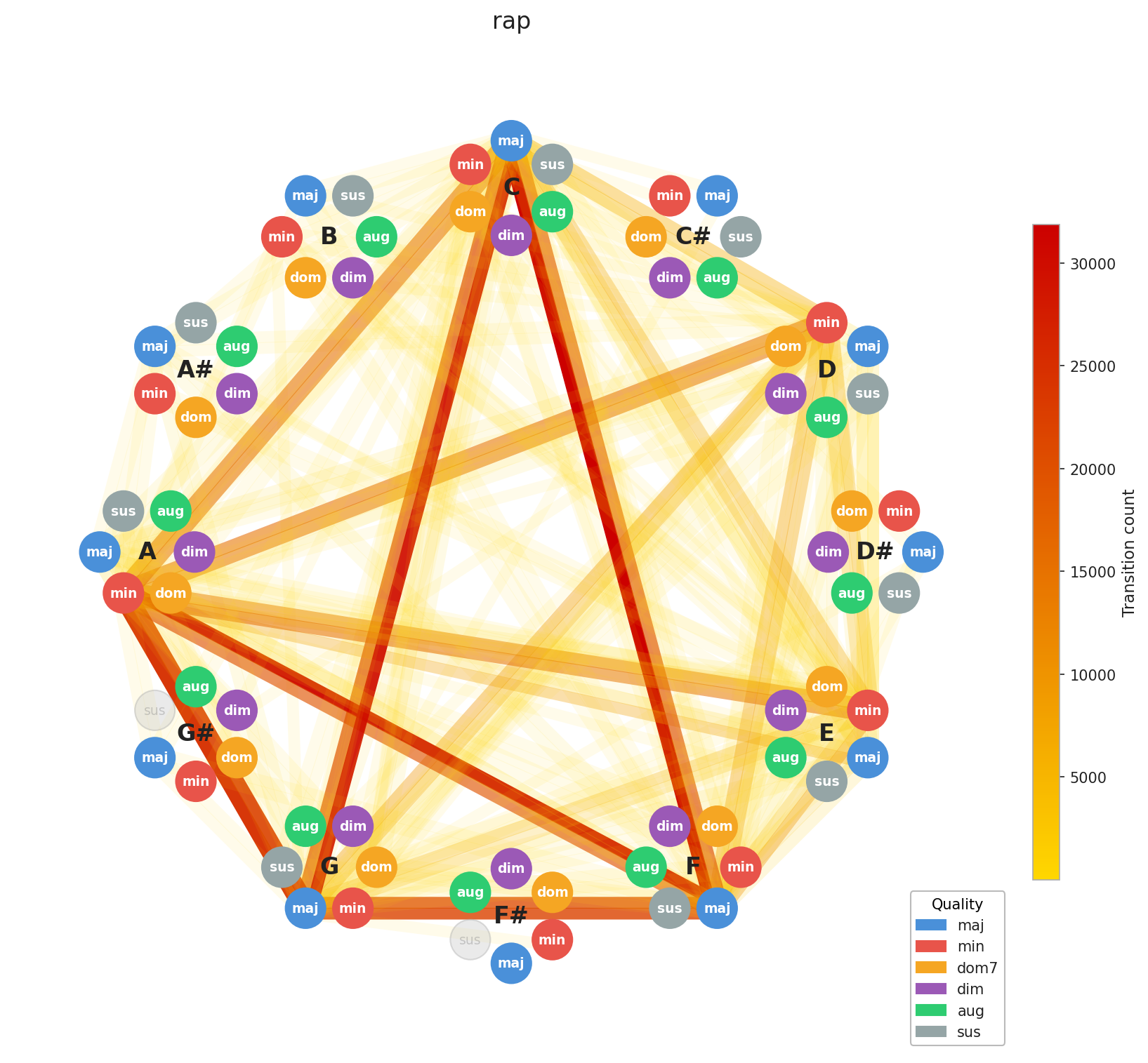
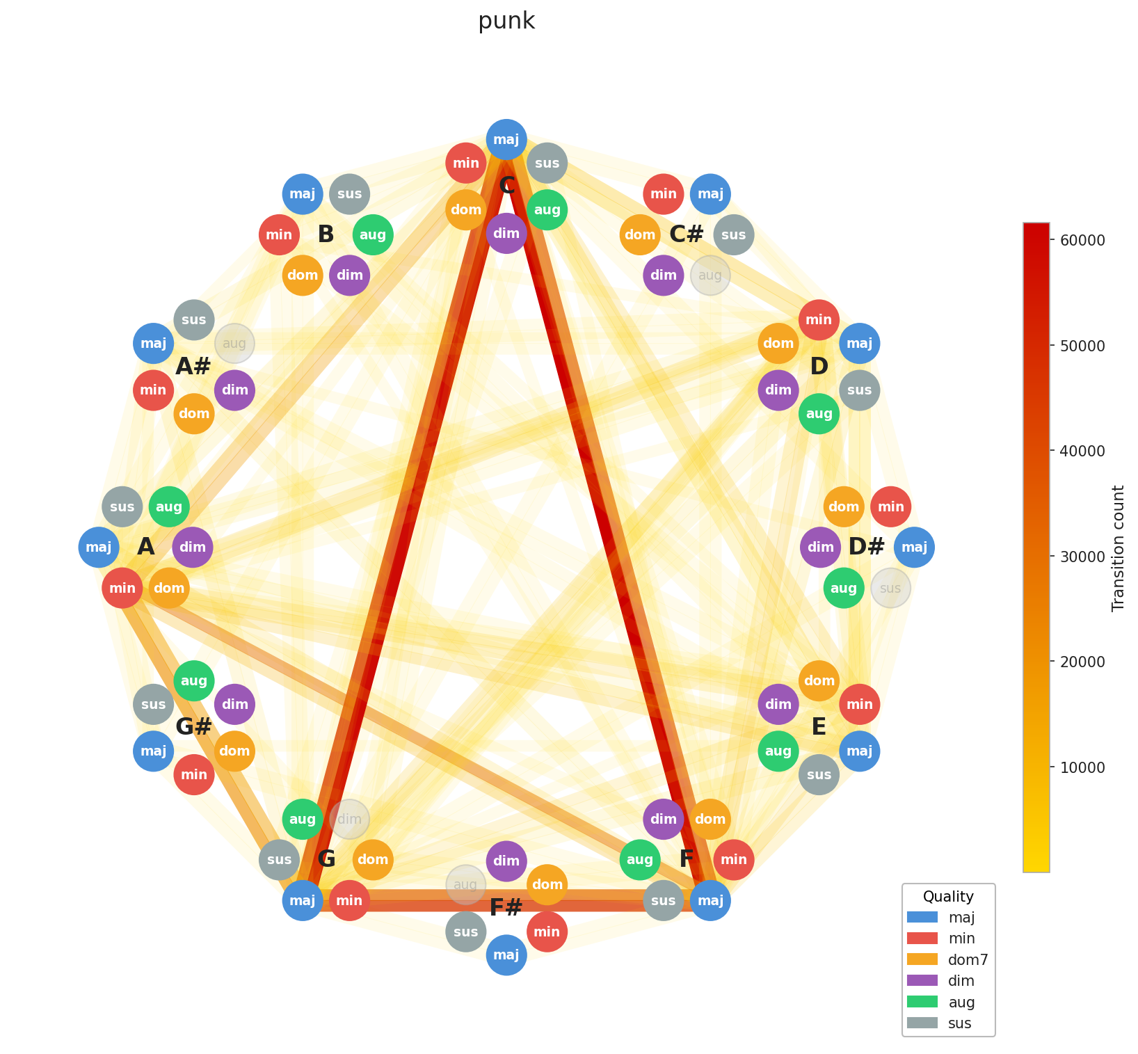
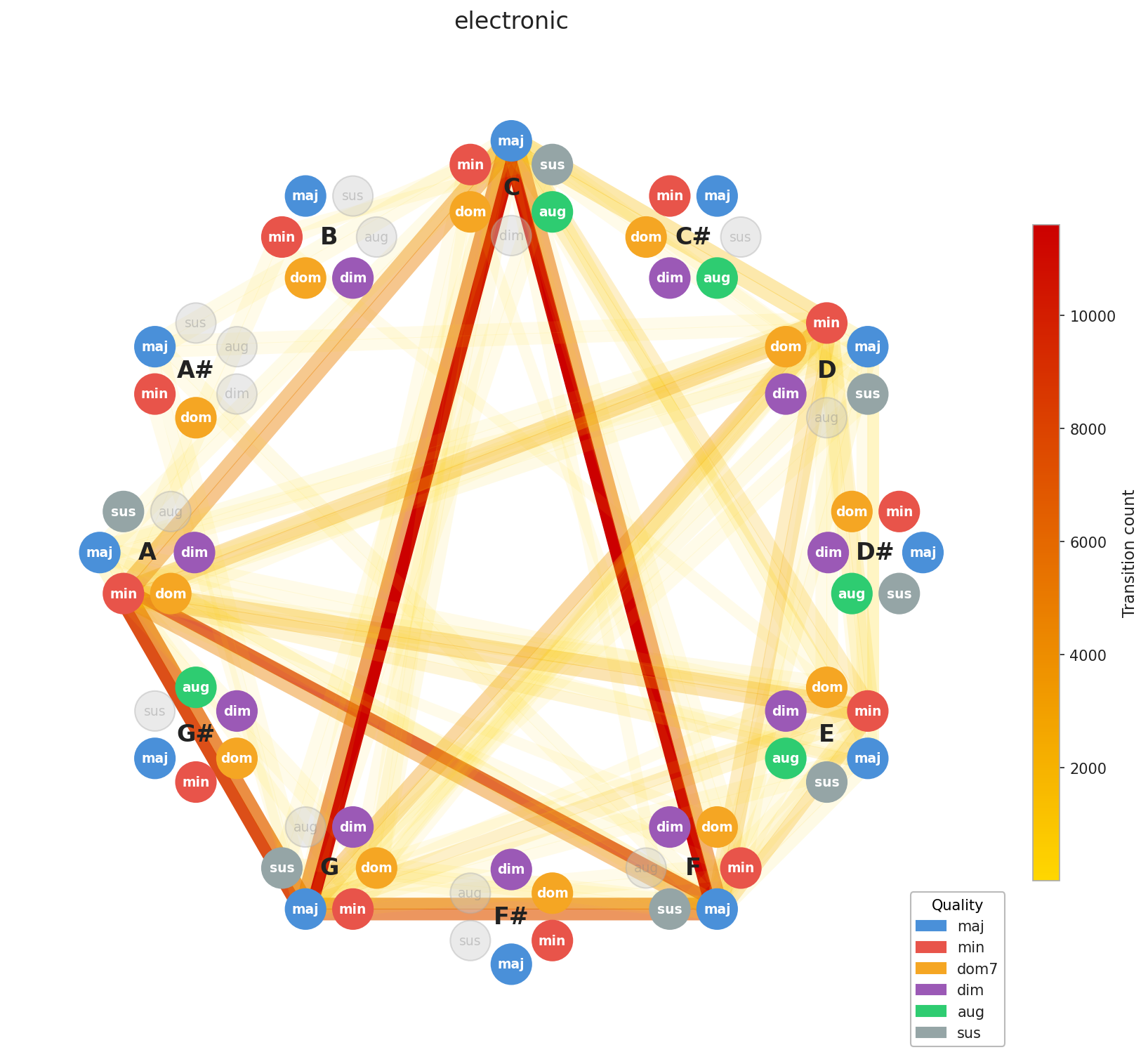
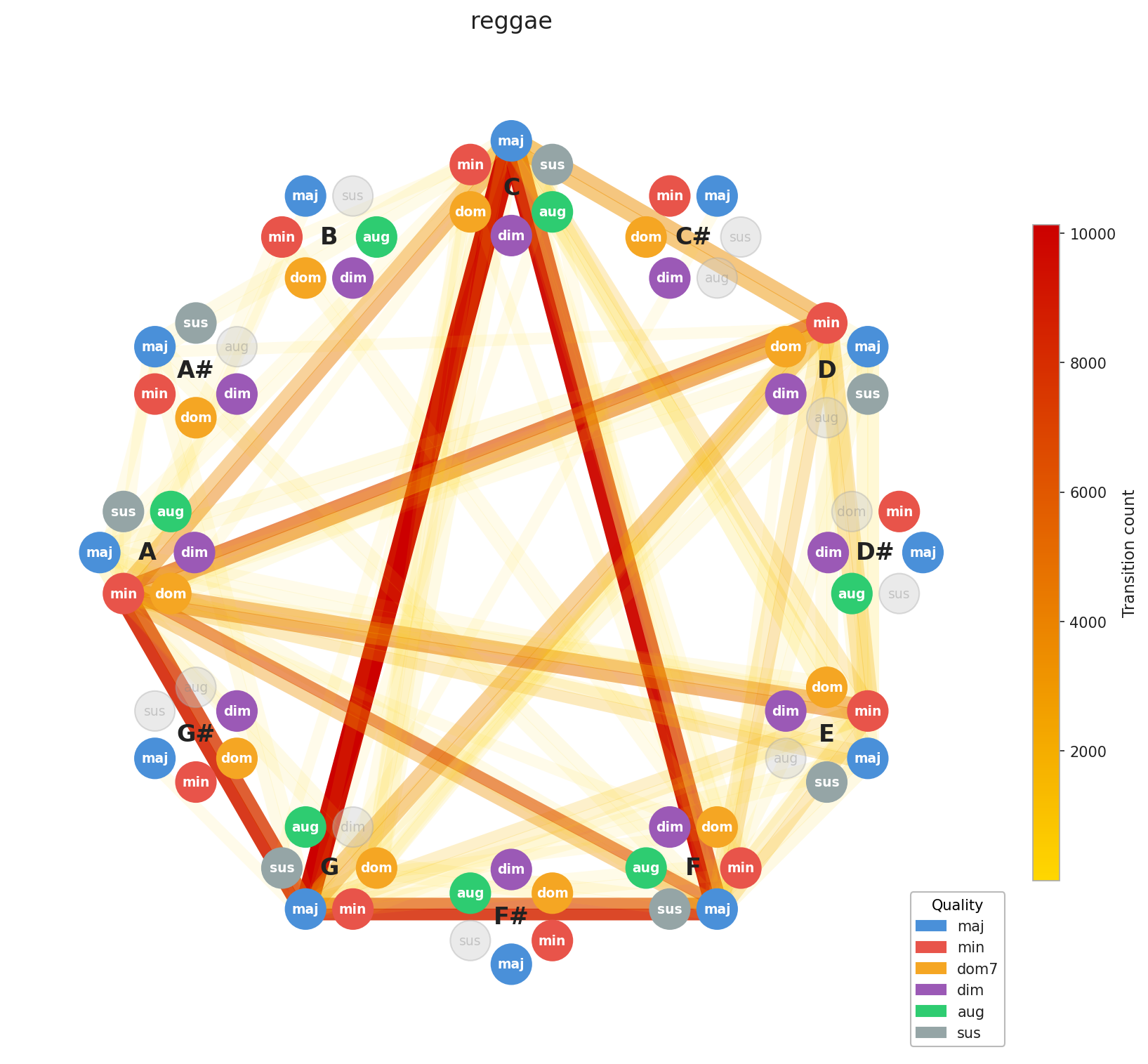
A few things stand out immediately. EDM’s concentration is no surprise, the genre is built on repetition by design, and the graph reflects that. Across the board, you can see clustering around C, F, and G, with a secondary pull toward A minor. That’s exactly the chord profile you’d expect from our C major / A minor calibration, and it confirms the standardization is working as intended. What’s more striking is how diverse Pop and Rock look by comparison. Their graphs sprawl. This makes intuitive sense: both genres have absorbed influences from blues, jazz, folk, and beyond, and that harmonic promiscuity shows up in the data.
Here’s the interesting implication: two songs can have nearly identical chord graphs and come from completely different musical worlds. The chords are the foundation; everything built on top like tempo, instrumentation, production, lyrics, this is what makes them feel distinct. This is Ed Sheeran’s point made visual. You can build many different houses on the same foundation plan.
Nearest Neighbords: Green Day Meets Johnny Cash
To find the most harmonically similar songs in the dataset I used Facebook’s FAISS (AI Similarity Search), an efficient nearest-neighbor search well-suited for this kind of high-dimensional comparison. The scripts are on GitHub if you want to dig in. Green Day was formative for me, so let’s use Welcome to Paradise as our test case. Here are its closest neighbors by chord graph similarity:
- Tudo Pro Alto - Charlie Brown Jr.
- Are You Gonna Be My Girl - Jet
- Radio Friendly Unit Shifter - Nirvana
- Cat’s in the Cradle - Harry Chapin (often covered by Johnny Cash)
Jet, Charlie Brown Jr., Nirvana, those make immediate sense. Punk-adjacent energy, power chord-driven songs. But Cat’s in the Cradle? That one stops you cold.
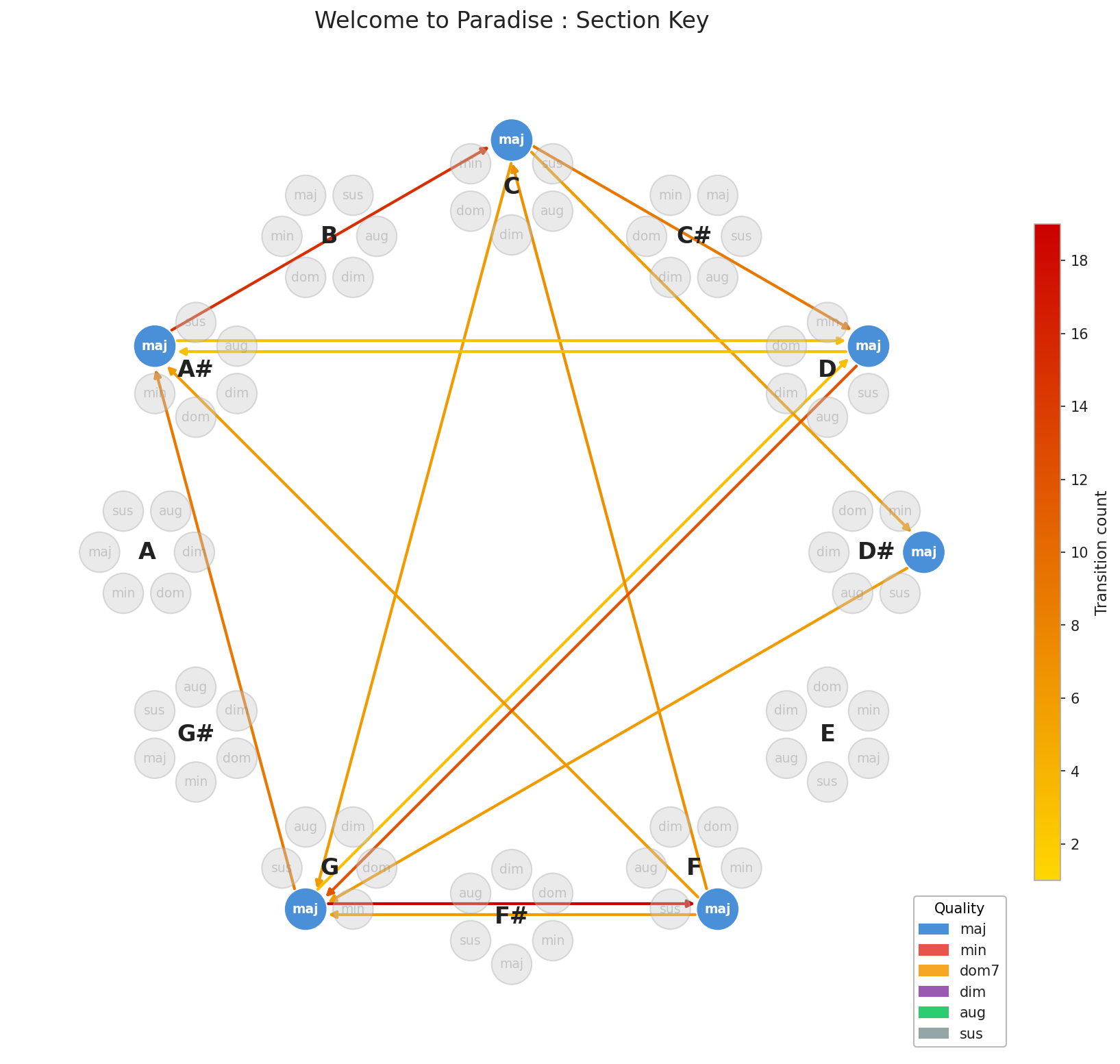
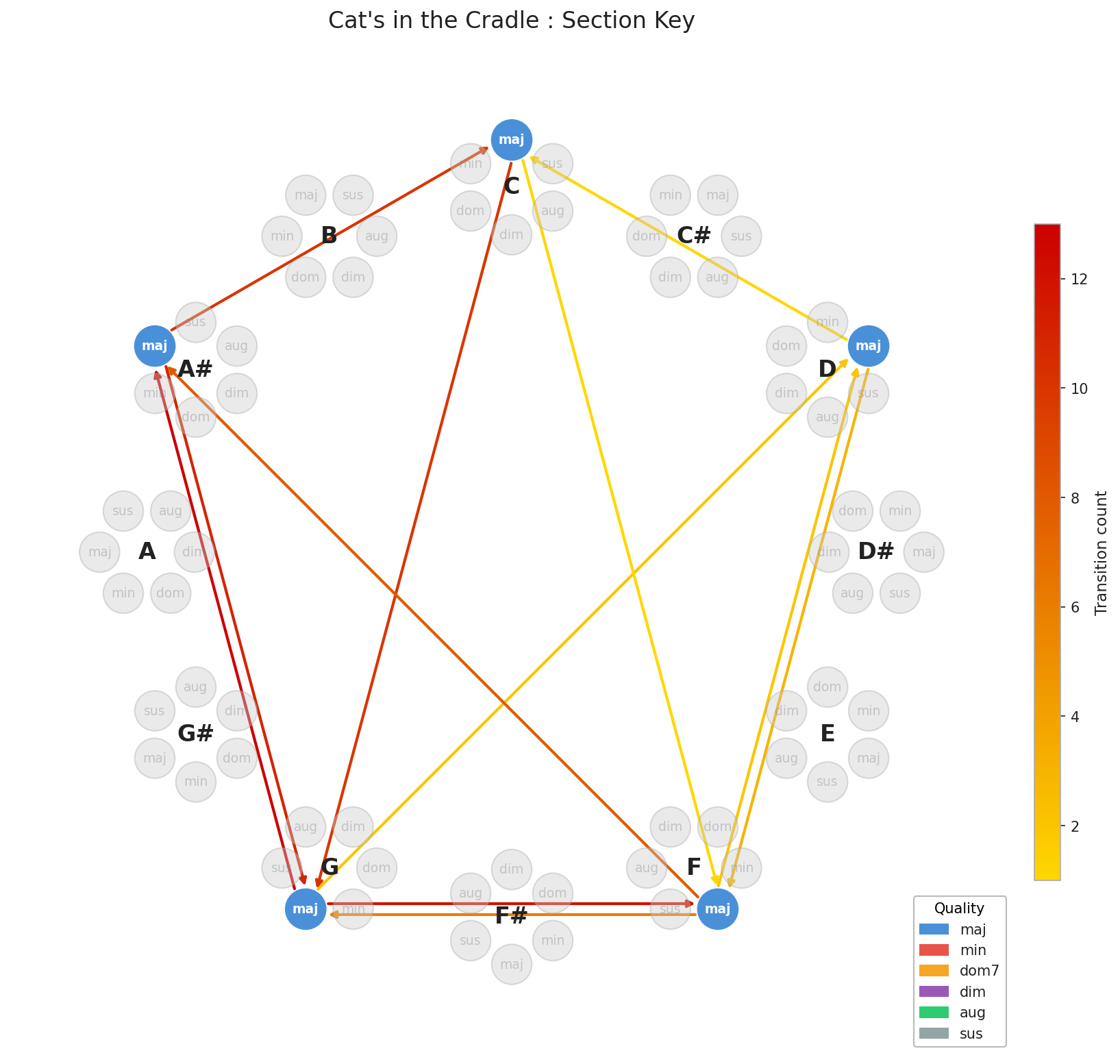
Looking at the graphs, the structural similarity is real. And yet, if you give both songs a listen and the resemblance is almost impossible to hear. Whether that’s due to my untrained ear, the power of arrangement and production to disguise underlying structure, or simply evidence that two songs can share DNA while having nothing else in common (probably all three) it’s a genuinely strange and fascinating result. It lends some credibility to the argument that the finite permutations of chords would eventually force convergence. It’s interesting that the convergence isn’t genre-bound. The walls between musical worlds may be thinner structurally than they sound.
Limitations and What Comes Next
This project hit a meaningful constraint partway through: Spotify deprecated its previous API, and the new system actively works against bulk data aggregation. The original goal was a song recommendation system built on harmonic similarity, potentially enriched with listener data and popularity metrics. That became unreachable. What I was able to work with instead was a pair of Kaggle datasets stitched together, around songs total, though only roughly had accessible titles. It’s a workable dataset, and the patterns that emerged are genuinely interesting, but a full analysis would benefit from:
- Richer chord data : capturing more variation beyond first-quality chords
- Tempo and instrumentation : the variables that make harmonically similar songs sound different
- Listener behavior data : to test whether harmonic similarity actually correlates with user preference
- Cluster detection : are there communities of songs that share harmonic vocabulary across genre lines?
There’s a fork-in-the-road quality to where this landed. I could invest further in hunting down the data, or accept that we’ve surfaced some genuinely cool patterns and treat this as a proof of concept. I’m calling it the latter, a natural stopping point that’s worth returning to if the right dataset shows up. The unexpected connections are the real takeaway. A Green Day track and a folk ballad sharing structural DNA. Genre may be more of a surface phenomenon than we think.